S4.45 Jim Hood

Pretorian typeface
Pretorian probably originated at P.M. Shanks and Sons, Ltd., The Patent Type Foundry, London. Also came in an Outline style. Caslon showed a wood type version in three widths as Rhodesian.
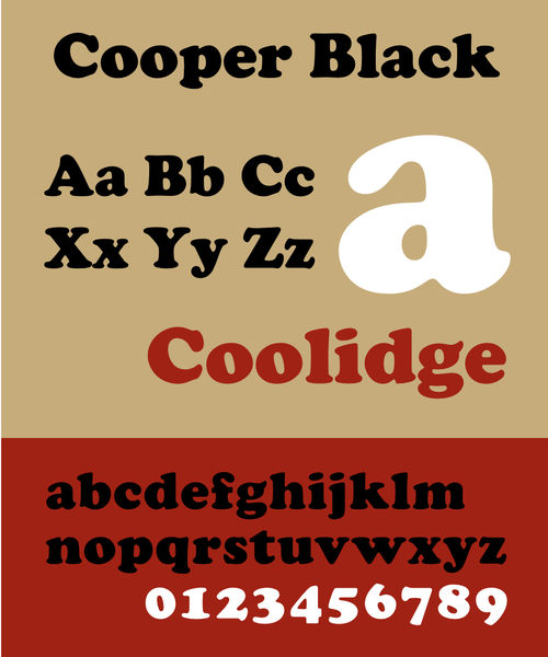
Cooper Black
Cooper Black is an ultra-bold serif typeface intended for display use that was designed by Oswald Bruce Cooper and released by the Barnhart Brothers & Spindler type foundry in 1922.
See also: https://forums.stevehoffman.tv/threads/album-covers-that-use-the-cooper-black-font.654437/
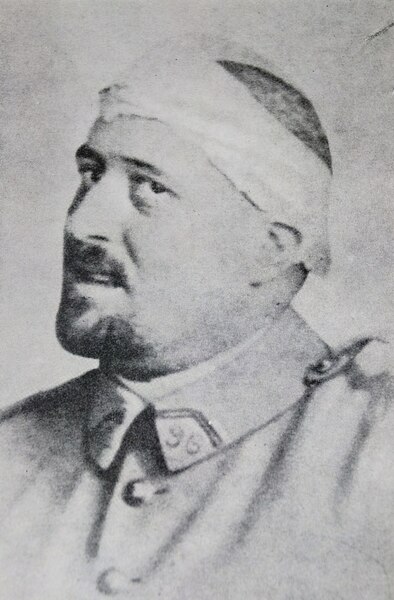
Guillaume Apollinaire
Apollinaire is considered one of the foremost poets of the early 20th century, as well as one of the most impassioned defenders of Cubism and a forefather of Surrealism. He is credited with coining the term "Cubism"
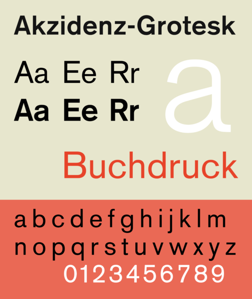
Akzidenz Groteque
Akzidenz-Grotesk is a sans-serif typeface family originally released by the Berthold Type Foundry of Berlin. "Akzidenz" indicates its intended use as a typeface for commercial print runs such as publicity, tickets and forms, as opposed to fine printing, and "grotesque" was a standard name for sans-serif typefaces at the time.
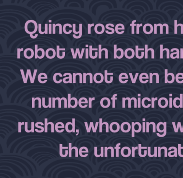
Coolvetica typeface
In the digital period, Canadian type designer Ray Larabie has released several digital fonts based upon Helvetica. The most widely known and distributed of these is Coolvetica, which Larabie introduced in 1999; Larabie stated he was inspired by Helvetica Flair, Chalet, and similar variants in creating some of Coolvetica's distinguishing glyphs (most strikingly a swash on capital 'G', lowercase 'y' based on the letterforms of 'g' and 'u,' and a fully curled lowercase 't'), and chose to set a tight default spacing optimised for use in display type.
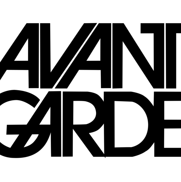
ITC Avant Garde
ITC Avant Garde Gothic is a geometric sans serif font family based on the logo font used in the Avant Garde magazine. Herb Lubalin devised the logo concept and its companion headline typeface, and then he and Tom Carnase, a partner in Lubalin's design firm, worked together to transform the idea into a full-fledged typeface.
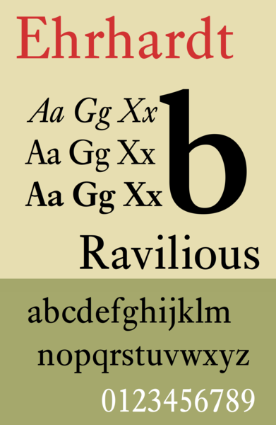
Ehrhardt (typeface)
Ehrhardt is an old-style serif typeface released by the British branch of the Monotype Corporation in 1938. Ehrhardt is a modern adaptation of printing types of "stout Dutch character" from the Dutch Baroque tradition sold by the Ehrhardt foundry in Leipzig.
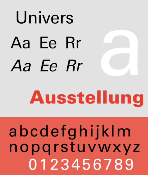
Univers
Univers was one of the first typeface families to fulfil the idea that a typeface should form a family of consistent, related designs. Past sans-serif designs such as Gill Sans had much greater differences between weights, while loose families such as American Type Founders' Franklin Gothic family often were advertised under different names for each style, to emphasise that they were not completely matching.
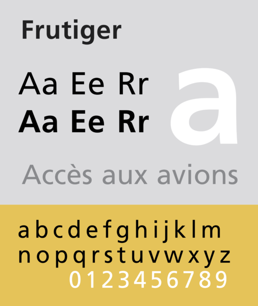
Frutiger
Frutiger is a sans-serif typeface by the Swiss type designer Adrian Frutiger. It is the text version of Frutiger's earlier typeface Roissy, commissioned in 1970/71 by the newly built Charles de Gaulle Airport at Roissy, France, which needed a new directional sign system, which itself was based on Concorde, a font Frutiger had created in the early 1960s.
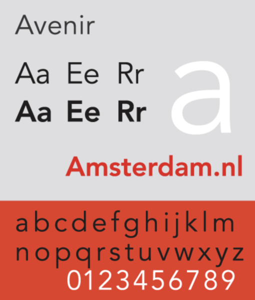
Avenir
Frutiger described Avenir as his finest work: "The quality of the draftsmanship – rather than the intellectual idea behind it – is my masterpiece. (...) It was the hardest typeface I have worked on in my life. Working on it, I always had human nature in mind. And what's crucial is that I developed the typeface alone, in peace and quiet – no drafting assistants, no-one was there. My personality is stamped upon it. I'm proud that I was able to create Avenir."
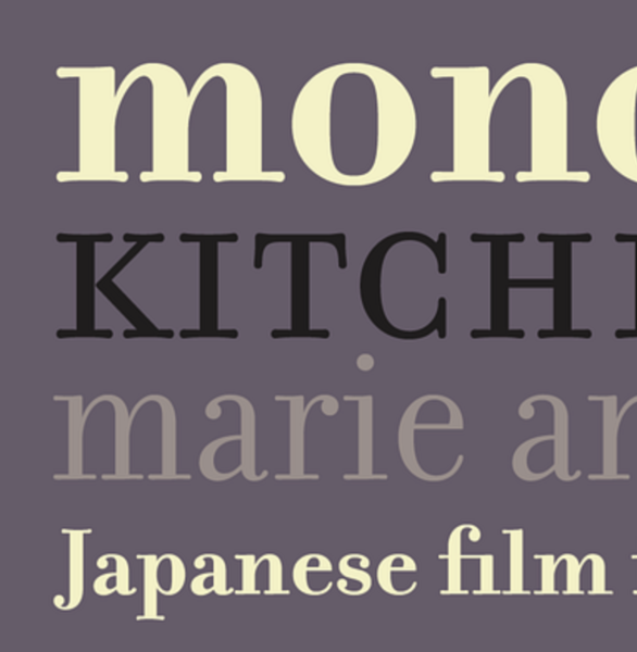
Filosophia
Filosofia is Zuzana Licko’s interpretation of a Bodoni font. It shows her personal preference for a geometric Bodoni, while incorporating such features as slightly bulging round serif endings which often appeared in the printed samples of Bodoni’s work and reflect Bodoni’s origins in letterpress technology.
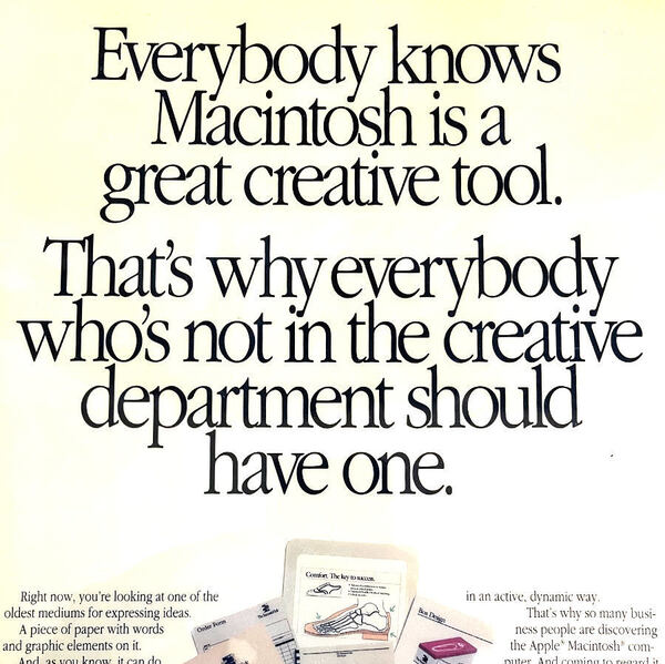
Apple Garamond
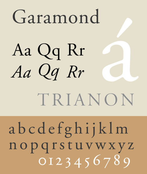
In cases where the Apple logo was accompanied by text, it was always set in Apple Garamond. Aside from the company name, most of Apple's advertising and marketing slogans, such as "Think different", used the font as well.
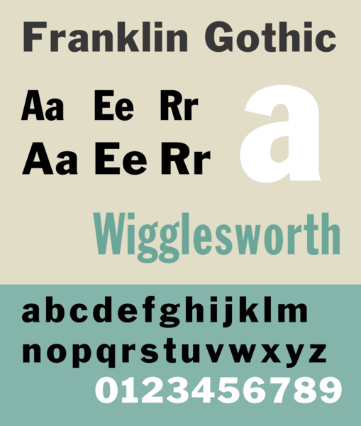
Franklin Gothic
Franklin Gothic has been used in many advertisements and headlines in newspapers. The typeface continues to maintain a high profile, appearing in a variety of media from books to billboards. Despite a period of eclipse in the 1930s, after the introduction of European faces like Kabel and Futura, they were re-discovered by American designers in the 1940s and have remained popular ever since. Benton's Franklin Gothic family is a set of solid designs, particularly suitable for display and trade use such as headlines rather than for extended text. Many versions and adaptations have been made since
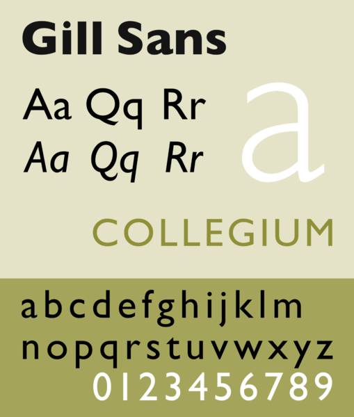
Gill Sans
Gill Sans is based on Edward Johnston's 1916 "Underground Alphabet", the corporate font of London Underground. As a young artist, Gill had assisted Johnston in its early development stages.


